Tuesday, December 10, 2013

Aperture

F2.8 Aperture
F16 Aperture
1. We should associate aperture with probably the face or the torso area.
2. the smaller the aperture the brighter the picture is and the lower the definition is, the higher the aperture the darker and more defined the picture gets.
3. it impacts depth of field by focusing on something so the background is usually blurred or just dark.

Monday, December 2, 2013

Caption Writing

The blimp seen in the sky named after its captain The Nevara crashed into the "Eiffel Tower" of the city of Abilene TX because the captain Andrew Nevara took a wrong slight turn. This event took place on a Thursday many people we seriously injured but only few died from this accident, this was a sad day for many people and their families.
Alfred Eisenstaedt's photograph of an American sailor kissing a woman in Times Square became a symbol of the excitement and joy at the end of World War II. The Life photographer didn't get their names, and several people have claimed to be the kissers over the years.<a href='http://www.usni.org/store/books/aircraft-reference/american-fighters/kissing-sailor' target='_blank'> A book released last year</a> identifies the pair as George Mendonsa and Greta Zimmer Friedman. "Suddenly, I was grabbed by a sailor," <a href='http://lcweb2.loc.gov/diglib/vhp/story/loc.natlib.afc2001001.42863/transcript?ID=sr0001' target='_blank'>Friedman said in 2005</a>. "It wasn't that much of a kiss. It was more of a jubilant act that he didn't have to go back (to war)."
1. Joey Gray Kisses Beth Gonzalez on Friday at 2:30 p.m. in Times Square in New York City. Gray excitedly grabbed Gonzalez when the news was announced that the allies had defeated the Nazis, ending WWII.
Following a crackdown that resulted in the deaths of hundreds of student demonstrators in Beijing, a lone Chinese protester steps in front of People's Liberation Army tanks in Tiananmen Squarein 1989. At least five photographers captured the event, which became a symbol of defiance in the face of oppression. Charlie Cole, working for Newsweek, won a World Press Photo Award for his version of the image. The identity and fate of the "Tank Man" remains unclear.
2. A man named Jeff was walking down his street in front of military tanks in an act of protest against the communist power on a friday afternoon around 3:45 in Vietnam. As he sees the tanks he walks in the street fearlessly to show he's not afraid of what might happen.
Five decades after her death, Marilyn Monroe remains one of Hollywood's most adored sex symbols. Her sultry legacy is often traced back to the 1954 image of her posing over a New York City subway grate in character for the filming of "The Seven Year Itch." Monroe's then-husband, Joe DiMaggio, reportedly witnessed the spectacle and became enraged with jealousy. They divorced weeks later.
A very beautiful woman named Marilyn in the city of Chicago, Illinois around 8:15 walked out her house. Marilyn was on her way to a dinner date when the air vents caught her off guard and blew her dress up and she tried to cover up cause it was cold. She eagerly posed for this picture because she knew she looked good.

Thursday, October 17, 2013

Academic Shoot Reflection

  1. The main problem was getting the pictures to not be blurry other than that the rules were pretty easy to follow you just have to put thought and your own imagination to make it your own work.
  2. The focus, Framing and Holding the camera good enough to get good pictures. To get that i basically held my breath and held the camera really still.
  3. I would try to not have crappy pictures and focus more on actually getting some good shots instead of trying to just get it done.
  4. My ideas were pretty good so i would keep my concepts and help the camera focus.
  5. In my opinion it would be the lines or avoiding mergers because they have the simple concept to follow and its easier for me to take a bad picture than any other rule.
  6. Framing
  7. Nothing

Tuesday, October 15, 2013

Academics Shoot

                                                                            Lines
I followed this rule somewhat bad because i meant for the lines to be the lining up of the desks but it was put somewhere irrelevant. The subject is supposed to be the desks going diagonally in a line. In this picture the subject is very unclear and most people wouldn't get it. I should have aimed and guaranteed a line visible to everyone.

                                                                         Simplicity
In this photo i kinda followed the simplicity rule the only flaw is that its poorly thought about and shot. The subject is the drawing and its mega interesting. This shows a clear dominant image and subject shown by the artwork. I could have just shot this picture better or just took a picture of something simpler than this drawing.

                                                                     Rule of Thirds
I followed this rule kinda poorly too. The subject of the picture is a grow of students working in history class. If you were to see this picture you could very easily see the subjects of this photo. I followed this adequately all together but there are still some improvements i could make like make the picture less blurry.

                                                                             Balance
This picture was poorly shot as well. The subject of this picture is the two students standing equally apart. When you see this picture the subject is clear in every way. This photo can be improved greatly by just simply just taking a more balanced photo than this.

                                                                            Framing
I feel i followed this rule good. The subject of the picture is the  students clumped together and the frame of the picture is supposed to be the higher wall on the ceiling. The subject in this picture is clear and is also interesting. I could improve the quality.
                                                                 
                                                                     Avoiding Mergers
I followed this rule pretty good. The subject is the student in the black shirt but the one that has the texas jacket is being cut off and is blurry. The subject is clear in this photo but its blurry at the same time. I followed this rule great i mean who can't take a bad picture.

Wednesday, October 2, 2013

Academics Shoot Preview

The Story
It shows how two people are working together to create a light source i think the story behind this is they were in class and the electricity went out and they used those tools to create a source of light so they can work normally.
                                                                      Action or Emotion
It shows the two students messing with the teacher and it shows a whole lot of happiness between them this photo is a good way of expressing the feeling of happiness.
 Fills the Frame
This shows students helping the homeless by handing out food and drinks this certainly fills the frame of the picture with a lot of action and and people.
I picked this Photo because i like music so by putting the liquid on a subwoofer and making it bounce like that just seems cool to do this shows emphasis on the subwoofer and the bouncing paint in the middle.

I could take pictures like these in many places like my classes and the office and the theater and all that good stuff. I would like to take pictures in the theater class or possibly my english class. I will try to practice putting stuff in the frames and lining it all up i will also try to improve on my steady hand so i can get more clearer pictures.


Monday, September 30, 2013

Elements of Art and Principles of Design

Line- are marks made by a pointed tool: brush, pencil, pen, etc. Lines can vary in width, direction, curvature, length, or color.
This Photo is of a cafe at late night with people dressed fancy the sidewalks and the contours of the shop show the element of art known as Line.
Shape- are formed wherever the ends of a continuous line meet. Geometric shapes such as circles, triangles or squares have perfect, uniform measurements and don't often appear in nature. Organic shapes are associated with things from the natural world, like plants and animals.
This is graffiti that shows many shapes that were put together to make this graffiti pop more than any other  picture this is an example of the element of shape.
Color- wheels show the primary colors, secondary colors, and the tertiary (intermediate) colors. They also show the relationships between complementary colors across from each other, such as blue and orange; and analogous (similar or related) colors next to each other such as yellow, green, and blue. Black and white may be thought of as colors but, in fact, they are not. White light is the presence of all color; black is the absence of reflected light and therefore the absence of color.
This photo shows colorful lights and shows the few colors which are pretty common in society which represents the color element of art.
Value (Tone)- refers to dark and light; the value scale refers to black and white with all gradations of gray in between. Value contrasts help us to see and understand a two-dimensional work of art.
This photo shows 6 cups lined up in black and white this shows great value because there are white parts and black parts with a mix of grey and the shades get darker and darker as you skim the picture.
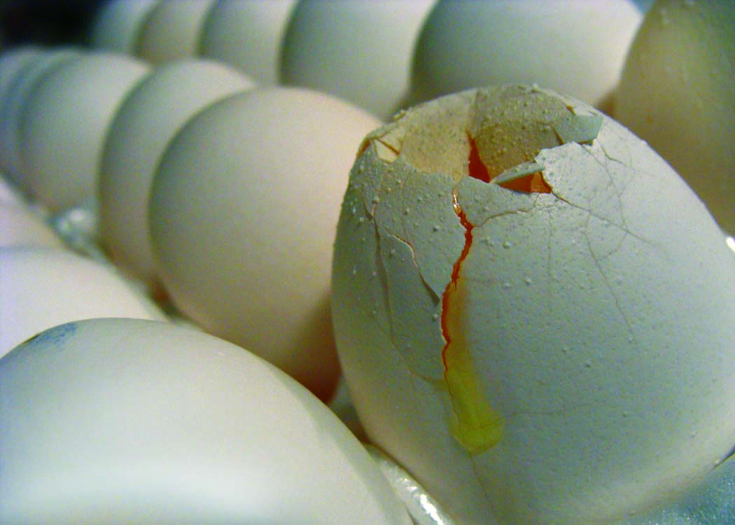
Form- describes objects that are three-dimensional, having length, width, and height.
This photo shows eggs but one is cracked this shows great form showing everything in a  3d perspective thus making this a good example of the element of  Form.

Texture- can be rough, bumpy, slick, scratchy, smooth, silky, soft, prickly--the list is endless. Texture refers to the surface quality, both simulated and actual, of artwork
I like this photo for texture because if you look at it you can actually feel it with your  eyes this is a good example of the element of Texture.

Space- refers to distances or areas around, between, or within components of a piece. Space can be positive (white or light) or negative (black or dark), open or closed,shallow or deep, and two-dimensional or three-dimensional.
In this photo it shows straws with black space around them  showing the element of art known as Space.

Balance- is the comfortable or pleasing arrangement of things in art. There are three different types of balance: symmetrical, asymmetrical, and radial. The human figure is symmetrically balanced; the same on the left and right side. The tree is asymmetrically balanced; its branches are not distributed equally on each side, but their total weight is balanced left and right. The sun is an example of radial balance; all its rays are equal in length from the center.
This photo of a girl with extremely long pigtails shows symmetry in the whole photo she is in the dead center looking out this shows the element of art known as Balance.
Contrast- is created by using elements that conflict with one another. Often, contrast is created using complementary colors or extremely light and dark values. Contrast creates interest in a piece and often draws the eye to certain areas. It is used to make a painting look interesting.
This photo is of the elements of earth wind fire and water but in this it shows the opposites on the other side of each other this shows the element of art known as contrast.


Emphasis- in the focal area of an artwork gives it importance. An artist may stress some elements of the design over others. The eye of the viewer will focus on the area of emphasis or center of interest first, then take in the rest of the composition.
This picture shows a black key but the attention is put on that one black key it shows the element of art known as emphasis.


Movement- in an artwork means the artist is taking viewers on a trip through the work by means of lines, edges, shapes, and colors often leading to the focal area. Movement is a visual flow through the composition. It can be the suggestion of motion in a design as you move from object to object by way of placement and position. Directional movement can be created with a value pattern. It is with the placement of dark and light areas that you can move your attention through the format.
This photo shows a street with cars going by in this quick motion camera the headlights show the glow of the streets this shows Movement another element of art.


Pattern- are made in art when the same shapes or elements are repeated again and again. Pattern uses the elements of art in planned or random repetitions to enhance surfaces of paintings or sculptures.
This is a photo of a street curve with the signs showing its curving in a pattern.

Rhythm- is the repetition of shapes, lines, and forms. Rhythm is a movement in which some elements recurs regularly. Like a dance, it will have a flow of objects that will seem to be like the beat of music
This Photo shows the element of art known as rhythm shown by the repetition of the shape of the lanterns on the ceiling.
Unity- means that all elements in an artwork are in harmony. Unity brings together a composition with similar units. For example, if your composition was using wavy lines and organic shapes you would stay with those types of lines and not put in even one geometric shape.
This shows a sunset on a mountainous horizon which is very beautiful to see and it shows unity by showing that all the elements in this piece is in harmony with one another this is an excellent example of unity.

Thursday, September 26, 2013

Avoiding Mergers

This is a picture of an American flag in black and white, this photo is not very good to be honest the picture cuts out the sides of the flag and even cuts out the pieces of the stars and stripes.

Frame

This is a picture of NYPD in a truck with a mask on this shows the element of Frame because the window acts like a frame for the actual picture which is the officer in the truck.

Balance

This shows New York's skyline in a way this photo is balanced well and its somewhat symmetrical and if you split this photo in half you would probably be in half and both sides would look equal.

Lines

This is a picture of one of the few people who decided to leap from the twin towers this shows line by the vertical lines shown on the side of the building which shows that the man is falling downwards.

Rule Of Thirds

This picture shows a building in new york right next to one of the twin towers this building is on the Rule of Thirds line vertically so this shows a good example of the Rule of Thirds element of art.

Simplicity

This Picture is of a "street gravestone" which shows simplicity because its a simple picture with simple elements it gives it that sentimental value while being basic.

Friday, September 20, 2013

40 Greatest Photos Ever

 I like this picture its peaceful to see and experience the photographer set this picture up so we can see that the two people are holding hands showing unity and togetherness in the nation of Cairo, Egypt. This photo in my opinion made the top 40 pictures because its just such a peaceful picture with everyone praying and connecting with their gods together and they're  two different religions. [Photo By Nevine Zaki]
 This photo shows the olympic games i like this picture because the whole situation is just mind boggling. This photo is a powerful photo indeed this picture shows that these men aren't afraid to show their nation and represent themselves as being powerful black individuals. The photographer did good in this picture because by showing just the black men doing their thing  and everything else in a blur. This photo would definitely make the list because this is just so amazing and influential. [Photo By Associated Press]
This photo shows the end of a riot where the riot police are walking away from the scene where they knocked out this mans girlfriend and he's down there kissing her. The photographer did a fantastic job in my opinion because they blurred out the officers but they're still in the picture but the main focus is on the man kissing his girlfriend even though she's knocked out. This photo is definitely a good photo on the list it shows people that no matter what happens we will stick with each other if it benefits the people around them. [Photo By Rich Lam]

Photo Manipulation

In my opinion this photo is unethical because it shows Oprah Winfrey with another girls body and frame and i think thats wrong. Oprah is known to be a big strong black woman so if you show this to people they'll think oh this is her when she was younger but fail to realize that this is another woman's body and Oprah's head in the photo appears to be on there wrong and doesn't match her skin tone in some places.
In my opinion this photo is the least unethical, its unethical but not bad, because yeah they photoshopped a black dude in there to show diversity but its nothing they're just trying to find a way to make it seem diversified. Many schools may have different opinions but mine stays this isn't that big of a deal.

Photo Manipulation

Basically, people are using photoshop to make stories more interesting but its costing these people their jobs as journalists because photoshopping a photo is basically fraud and you can cause a lot of problems trying to photoshop an image like the missile launch photo if that would have caused a lot of controversy in the world if all the missiles were actually launched but they weren't, the whole thing about being a journalist is hard work you can't screw up someones report by photoshop and possibly get them fired for using photoshop. This type of photo editing is not acceptable because if you edit a photo you're lying to the people around you and all your peers would distrust you.

Wednesday, September 18, 2013

Post Shoot Reflection

Alyssa Villegas
http://villegas0311.blogspot.com/

Photo #1 Happy, This photo is a good photo i like the lighting and i like how the photo shows actual happiness in play. The one thing i don't like about this picture is that its a little blurry but other than that great photo.


Photo #2 Metal, This photo shows the handrails in the hallway and i think this picture is pretty good i like how you can see the fish bowl handrails through the other rails and it kinda just puts a lot in to the photos potential i also like how they got the poster in the shot too to add on to the red and blue on the handrails and the edges of the ceiling. One thing that can be improved would be the blurriness of the photo but other than that another great photo.


Photo #3 Red, This photo is a cool looking photo, i love the design of the shirt and its a nice shade of red, i also like the fact that the picture just shows the graphic on the t-shirt and how much design and thought put into this photograph. One thing that can be improved is the blurriness once again but other than that its a great photo.

National Geographic Picture

I love this photo because it shows a perfect example of something beautifully destructive, in a place where no one seems to live. This storm is so vivid and just so descriptive. I love the ambiance to this photo its crazy scary to be up next to that part but if you see it you may not be able to stay away from it because its just so attractive and attentive. This picture shows my view of the world perfectly, the world in my eyes is extremely beautiful in sights but on the inside things don't always go your way no matter what the situation is it can still tear your life apart.

Great Black and White Photographers Part 2

André Kertesz
Born July 2nd, 1894
Died September 28th 1985
He was born in Hungary and he was jewish
One of his portraits known as circus was shot in Budapest on May 19th, 1920
His first published photograph was a portrait named "Sleeping Boy"
He was in the Academy of Commerce until the year 1912
A portrait of a fork he took was from his "French Period" and was named "The Fork" or "La Fourchette"
                                                              UNKNOWN NAME
                                                   
UNKNOWN NAME
Wandering Violinist

Monday, September 16, 2013

Red, Metal, Happy

                                                                          Happy
                                                                             Red
                                                                           Metal