Monday, September 30, 2013

Elements of Art and Principles of Design

Line- are marks made by a pointed tool: brush, pencil, pen, etc. Lines can vary in width, direction, curvature, length, or color.
This Photo is of a cafe at late night with people dressed fancy the sidewalks and the contours of the shop show the element of art known as Line.
Shape- are formed wherever the ends of a continuous line meet. Geometric shapes such as circles, triangles or squares have perfect, uniform measurements and don't often appear in nature. Organic shapes are associated with things from the natural world, like plants and animals.
This is graffiti that shows many shapes that were put together to make this graffiti pop more than any other  picture this is an example of the element of shape.
Color- wheels show the primary colors, secondary colors, and the tertiary (intermediate) colors. They also show the relationships between complementary colors across from each other, such as blue and orange; and analogous (similar or related) colors next to each other such as yellow, green, and blue. Black and white may be thought of as colors but, in fact, they are not. White light is the presence of all color; black is the absence of reflected light and therefore the absence of color.
This photo shows colorful lights and shows the few colors which are pretty common in society which represents the color element of art.
Value (Tone)- refers to dark and light; the value scale refers to black and white with all gradations of gray in between. Value contrasts help us to see and understand a two-dimensional work of art.
This photo shows 6 cups lined up in black and white this shows great value because there are white parts and black parts with a mix of grey and the shades get darker and darker as you skim the picture.
Form- describes objects that are three-dimensional, having length, width, and height.
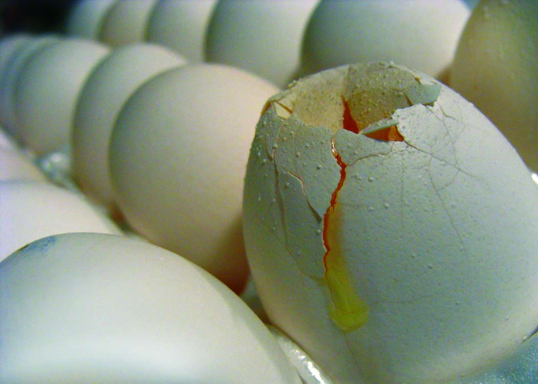
This photo shows eggs but one is cracked this shows great form showing everything in a  3d perspective thus making this a good example of the element of  Form.

Texture- can be rough, bumpy, slick, scratchy, smooth, silky, soft, prickly--the list is endless. Texture refers to the surface quality, both simulated and actual, of artwork
I like this photo for texture because if you look at it you can actually feel it with your  eyes this is a good example of the element of Texture.

Space- refers to distances or areas around, between, or within components of a piece. Space can be positive (white or light) or negative (black or dark), open or closed,shallow or deep, and two-dimensional or three-dimensional.
In this photo it shows straws with black space around them  showing the element of art known as Space.

Balance- is the comfortable or pleasing arrangement of things in art. There are three different types of balance: symmetrical, asymmetrical, and radial. The human figure is symmetrically balanced; the same on the left and right side. The tree is asymmetrically balanced; its branches are not distributed equally on each side, but their total weight is balanced left and right. The sun is an example of radial balance; all its rays are equal in length from the center.
This photo of a girl with extremely long pigtails shows symmetry in the whole photo she is in the dead center looking out this shows the element of art known as Balance.
Contrast- is created by using elements that conflict with one another. Often, contrast is created using complementary colors or extremely light and dark values. Contrast creates interest in a piece and often draws the eye to certain areas. It is used to make a painting look interesting.
This photo is of the elements of earth wind fire and water but in this it shows the opposites on the other side of each other this shows the element of art known as contrast.


Emphasis- in the focal area of an artwork gives it importance. An artist may stress some elements of the design over others. The eye of the viewer will focus on the area of emphasis or center of interest first, then take in the rest of the composition.
This picture shows a black key but the attention is put on that one black key it shows the element of art known as emphasis.


Movement- in an artwork means the artist is taking viewers on a trip through the work by means of lines, edges, shapes, and colors often leading to the focal area. Movement is a visual flow through the composition. It can be the suggestion of motion in a design as you move from object to object by way of placement and position. Directional movement can be created with a value pattern. It is with the placement of dark and light areas that you can move your attention through the format.
This photo shows a street with cars going by in this quick motion camera the headlights show the glow of the streets this shows Movement another element of art.


Pattern- are made in art when the same shapes or elements are repeated again and again. Pattern uses the elements of art in planned or random repetitions to enhance surfaces of paintings or sculptures.
This is a photo of a street curve with the signs showing its curving in a pattern.

Rhythm- is the repetition of shapes, lines, and forms. Rhythm is a movement in which some elements recurs regularly. Like a dance, it will have a flow of objects that will seem to be like the beat of music
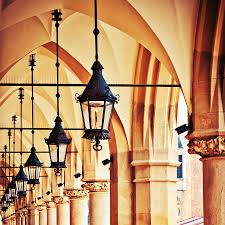
This Photo shows the element of art known as rhythm shown by the repetition of the shape of the lanterns on the ceiling.
Unity- means that all elements in an artwork are in harmony. Unity brings together a composition with similar units. For example, if your composition was using wavy lines and organic shapes you would stay with those types of lines and not put in even one geometric shape.
This shows a sunset on a mountainous horizon which is very beautiful to see and it shows unity by showing that all the elements in this piece is in harmony with one another this is an excellent example of unity.

Thursday, September 26, 2013

Avoiding Mergers

This is a picture of an American flag in black and white, this photo is not very good to be honest the picture cuts out the sides of the flag and even cuts out the pieces of the stars and stripes.

Frame

This is a picture of NYPD in a truck with a mask on this shows the element of Frame because the window acts like a frame for the actual picture which is the officer in the truck.

Balance

This shows New York's skyline in a way this photo is balanced well and its somewhat symmetrical and if you split this photo in half you would probably be in half and both sides would look equal.

Lines

This is a picture of one of the few people who decided to leap from the twin towers this shows line by the vertical lines shown on the side of the building which shows that the man is falling downwards.

Rule Of Thirds

This picture shows a building in new york right next to one of the twin towers this building is on the Rule of Thirds line vertically so this shows a good example of the Rule of Thirds element of art.

Simplicity

This Picture is of a "street gravestone" which shows simplicity because its a simple picture with simple elements it gives it that sentimental value while being basic.

Friday, September 20, 2013

40 Greatest Photos Ever

 I like this picture its peaceful to see and experience the photographer set this picture up so we can see that the two people are holding hands showing unity and togetherness in the nation of Cairo, Egypt. This photo in my opinion made the top 40 pictures because its just such a peaceful picture with everyone praying and connecting with their gods together and they're  two different religions. [Photo By Nevine Zaki]
 This photo shows the olympic games i like this picture because the whole situation is just mind boggling. This photo is a powerful photo indeed this picture shows that these men aren't afraid to show their nation and represent themselves as being powerful black individuals. The photographer did good in this picture because by showing just the black men doing their thing  and everything else in a blur. This photo would definitely make the list because this is just so amazing and influential. [Photo By Associated Press]
This photo shows the end of a riot where the riot police are walking away from the scene where they knocked out this mans girlfriend and he's down there kissing her. The photographer did a fantastic job in my opinion because they blurred out the officers but they're still in the picture but the main focus is on the man kissing his girlfriend even though she's knocked out. This photo is definitely a good photo on the list it shows people that no matter what happens we will stick with each other if it benefits the people around them. [Photo By Rich Lam]

Photo Manipulation

In my opinion this photo is unethical because it shows Oprah Winfrey with another girls body and frame and i think thats wrong. Oprah is known to be a big strong black woman so if you show this to people they'll think oh this is her when she was younger but fail to realize that this is another woman's body and Oprah's head in the photo appears to be on there wrong and doesn't match her skin tone in some places.
In my opinion this photo is the least unethical, its unethical but not bad, because yeah they photoshopped a black dude in there to show diversity but its nothing they're just trying to find a way to make it seem diversified. Many schools may have different opinions but mine stays this isn't that big of a deal.

Photo Manipulation

Basically, people are using photoshop to make stories more interesting but its costing these people their jobs as journalists because photoshopping a photo is basically fraud and you can cause a lot of problems trying to photoshop an image like the missile launch photo if that would have caused a lot of controversy in the world if all the missiles were actually launched but they weren't, the whole thing about being a journalist is hard work you can't screw up someones report by photoshop and possibly get them fired for using photoshop. This type of photo editing is not acceptable because if you edit a photo you're lying to the people around you and all your peers would distrust you.

Wednesday, September 18, 2013

Post Shoot Reflection

Alyssa Villegas
http://villegas0311.blogspot.com/

Photo #1 Happy, This photo is a good photo i like the lighting and i like how the photo shows actual happiness in play. The one thing i don't like about this picture is that its a little blurry but other than that great photo.


Photo #2 Metal, This photo shows the handrails in the hallway and i think this picture is pretty good i like how you can see the fish bowl handrails through the other rails and it kinda just puts a lot in to the photos potential i also like how they got the poster in the shot too to add on to the red and blue on the handrails and the edges of the ceiling. One thing that can be improved would be the blurriness of the photo but other than that another great photo.


Photo #3 Red, This photo is a cool looking photo, i love the design of the shirt and its a nice shade of red, i also like the fact that the picture just shows the graphic on the t-shirt and how much design and thought put into this photograph. One thing that can be improved is the blurriness once again but other than that its a great photo.

National Geographic Picture

I love this photo because it shows a perfect example of something beautifully destructive, in a place where no one seems to live. This storm is so vivid and just so descriptive. I love the ambiance to this photo its crazy scary to be up next to that part but if you see it you may not be able to stay away from it because its just so attractive and attentive. This picture shows my view of the world perfectly, the world in my eyes is extremely beautiful in sights but on the inside things don't always go your way no matter what the situation is it can still tear your life apart.

Great Black and White Photographers Part 2

André Kertesz
Born July 2nd, 1894
Died September 28th 1985
He was born in Hungary and he was jewish
One of his portraits known as circus was shot in Budapest on May 19th, 1920
His first published photograph was a portrait named "Sleeping Boy"
He was in the Academy of Commerce until the year 1912
A portrait of a fork he took was from his "French Period" and was named "The Fork" or "La Fourchette"
                                                              UNKNOWN NAME
                                                   
UNKNOWN NAME
Wandering Violinist

Monday, September 16, 2013

Red, Metal, Happy

                                                                          Happy
                                                                             Red
                                                                           Metal

Thursday, September 12, 2013

Camera Parts

Aperture- An opening or a slit or crack.
Shutter- Movable cover or slide.
Exposure- Revealing something or someone.
Depth Of Field- the range of distances along the axis of an optical instrument, usually a camera lens.
F-Stop- The setting go an adjustable lens Aperture, as indicated by an f number.
Focal Length- the distance from a focal point of a lens or mirror to the corresponding principal plane.

Camera History


  1. A tiny hole in a wall is created and light is focused through the hole and is projected upside down on the opposite wall
  2. Sir Issac Newton has created a glass lens
  3. Glass Lens, A Dark Box, and Film
  4. The light passes through the lens, into the camera and the film is shown and it captures the image wanted
  5. Digital Film
  6. Auto Mode-the camera will completely control the flash and exposure Program- automatic assist, you can control flash and a few other settings
  7. It attempts to blur out the background camera will use aperture or the fastest available lens setting
  8. To freeze motion, it will use the highest shutter speed possible
  9. Its to focus the camera shows done by indicating a green dot
  10. This symbol means the flash is off and you would use it when flash isn't needed such as in well lit areas you're shooting from
  11. This Symbol means the flash will flash if the camera sees it needs more light
  12. Too much light will wash the picture out
  13. Too little light will make the picture really dark
  14. Stop represents a relative change in the brightness of light
  15. 1
  16. 2
  17. More light is in the camera lens
  18. Less light is in the camera lens
  19. Aperture controls the light passing to the film its like a pupil
  20. You adjust the shutter to where the light is more absorbed

Masters of Black and White Photography

                                                                   Yousuf Karsh
                                                    Spring Song (Solange Gauthier)
                                                                      Andre Kertesz
                                                                 Wandering Violinist

                                                                 John Gutmann
                                                               Chord In Harlem

Wednesday, September 4, 2013

Best and Worst Photos


 In opinion this is my best photo i took, i like how she is centered in the middle of the photo kinda, and i like how the background just blends in with her person. This picture is also at an angle that is kind of interesting in a creative way. I chose to shoot this picture this way because its just a great looking angle.

In my opinion this one is my worst photo because its kind of a plain photo not much is happening to the  model but stuff is in the background that doesn't match the persons nature. I like the background image but this picture just doesn't look right to me. The picture is too dark and doesn't let much light in.